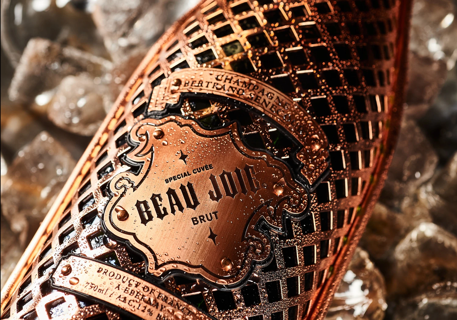
LOIVE

For LOIVE, a modern wellness tea brand, we developed a distinctive logo, refined visual identity and considered packaging system rooted in natural clarity and quiet sophistication.

Design & Interiors

Design & Interiors

Digital Experience

Digital Experience

Portfolio Presentation

Portfolio Presentation

LOIVE was created as a health-focused tea brand centred around purity, balance and intentional living. The identity needed to feel natural without being predictable — elevated yet approachable. We built the brand from the ground up, starting with a logo that feels clean, contemporary and quietly confident. The visual system draws on organic tones, subtle contrast and disciplined typography to communicate wellness in a refined way. The result is a brand that feels grounded and trustworthy — one that stands comfortably within the premium health space while remaining accessible.

Team

Creative Designer

Kseniya De Vivo

Deliverables

Logo Design

Visual Identity System

Colour & Typography Framework

Packaging Design (Scalable System)

Production-Ready Artwork Files

“Riviera captured the essence of our brand perfectly. The identity and packaging feel modern, clean and aligned with our wellness philosophy.”

— LOIVE Team

01

Brand Identity

The LOIVE logo was designed to feel calm and structured, balancing softness with clarity. Typography was selected to reflect modern wellness — minimal, elegant and highly legible. The colour palette draws from botanical influences and natural earth tones, reinforcing the product’s connection to health and plant-based ingredients without falling into cliché aesthetics.

02

Packaging Design

Packaging was developed to feel tactile, clean and shelf-ready. Layout hierarchy ensures clarity of flavour and benefits, while maintaining visual restraint. The system allows for scalability across multiple blends, supporting product expansion while preserving strong brand recognition. The final packaging balances simplicity with depth — communicating quality before the first sip.

More projects

More projects

Wooflore

For Wooflore, a custom pet portrait brand, we developed a cohesive visual identity, created performance-focused advertising creatives and refined the ecommerce website to support conversion and growth.

Wooflore

For Wooflore, a custom pet portrait brand, we developed a cohesive visual identity, created performance-focused advertising creatives and refined the ecommerce website to support conversion and growth.

Beau Joie Champagne

For Beau Joie Champagne, we managed the UK social presence and developed premium communication materials — supporting the brand’s positioning within global luxury, nightlife and high-profile collaborations.

Beau Joie Champagne

For Beau Joie Champagne, we managed the UK social presence and developed premium communication materials — supporting the brand’s positioning within global luxury, nightlife and high-profile collaborations.

Backwood Security

For Backwoods Security, a Canadian provider of industrial security solutions, we developed structured brochures and a clear iconography system to support communication across complex operational environments.

Backwood Security

For Backwoods Security, a Canadian provider of industrial security solutions, we developed structured brochures and a clear iconography system to support communication across complex operational environments.

Zeiss

For ZEISS, we developed a comprehensive point-of-sale concept and graphic system, working alongside Ignite Studio to support the interior implementation and ensure a cohesive retail environment.

Zeiss

For ZEISS, we developed a comprehensive point-of-sale concept and graphic system, working alongside Ignite Studio to support the interior implementation and ensure a cohesive retail environment.

FAQ

Get quick answers about working with us and our approach to digital solutions.

What’s included in a monthly retainer?

01

Each retainer includes a set number of design or strategy requests per month, priority turnaround, and a dedicated point of contact. It’s built for teams who want ongoing support without starting from scratch every time.

How many requests can I make per month?

02

We typically handle up to two active requests at a time, with new ones queued as they’re completed. Most deliverables are turned around within 48–72 hours, depending on complexity.

Is a retainer better than a one-off project?

03

If you need ongoing design support, faster turnarounds, or regular iterations, a retainer is often more cost-effective and collaborative than starting fresh each time.

Who will I be working with?

04

You’ll work directly with senior designers and strategists. No middle layers, no fluff—just experienced people doing the work.

Do you work with international clients?

05

Yes. Most of our clients are remote. We’re fully set up to collaborate across time zones with clear communication and shared tools.

Make it happen

Make it happen

Make it happen