Pavona

For Pavona, we developed a complete brand identity inspired by its interiors — a rich palette of peacock blues and greens, elevated with gold accents — and translated it into a distinctive name, visual system, website and curated brand assets.

Brand Naming

Brand Naming

Visual Identity & Logo

Visual Identity & Logo

Website Design

Website Design

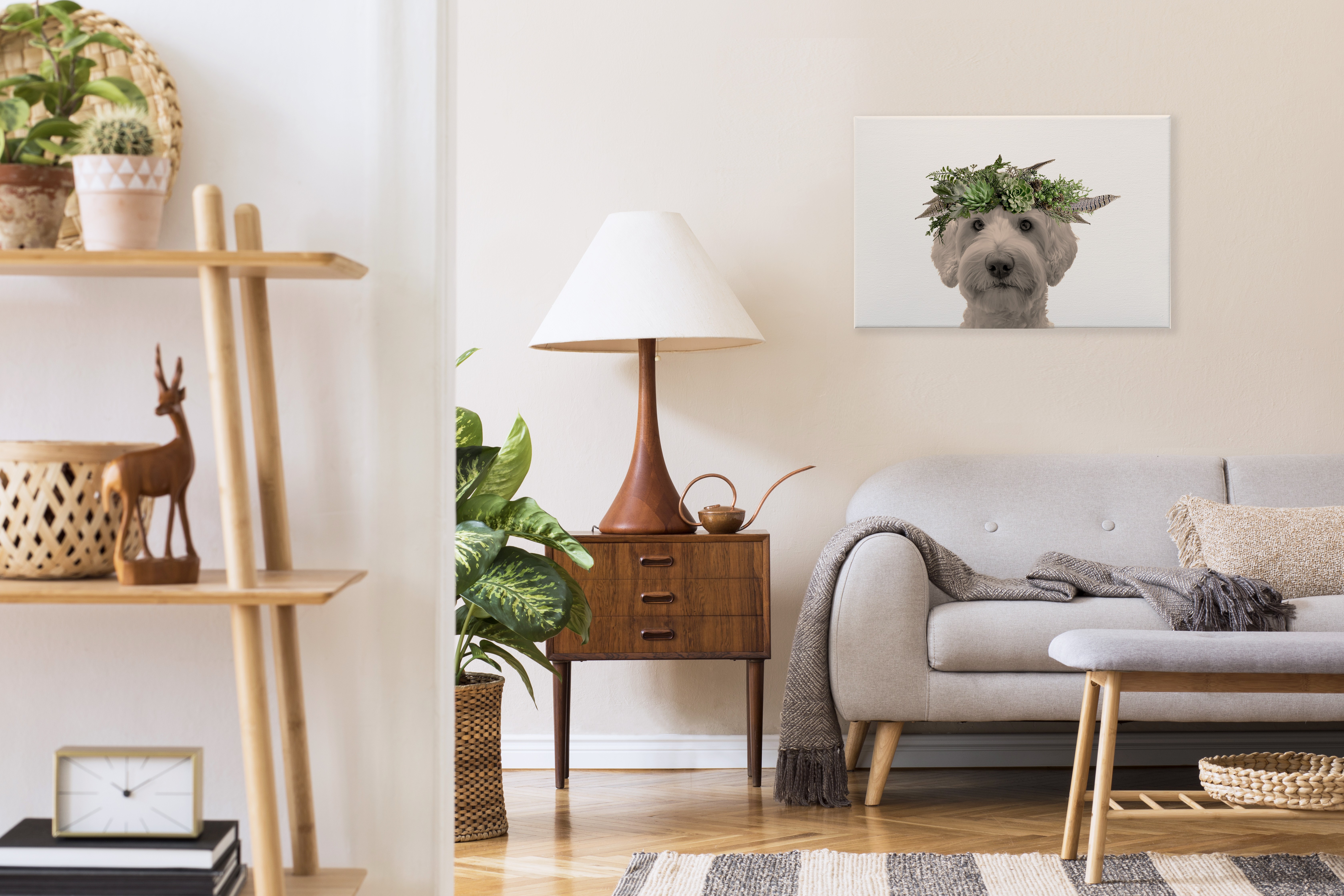
Pavona was conceived as an immersive dining experience shaped directly by its interior world. Rich peacock motifs, deep green and blue tones, and gold accents define the atmosphere — elegant, dramatic and unapologetically expressive. Our role was to translate this physical space into a complete brand universe. From naming to visual identity, website and menus, every element was developed to feel inseparable from the environment itself. Rather than imposing an external concept, the brand emerged from within the space — allowing the interiors to lead the story. The result is a cohesive identity where name, visuals and guest experience speak the same language.

Team

Creative Designer

Kseniya De Vivo

Deliverables

Brand Naming

Visual Identity & Logo

Website Design & Development

Menu & Print Collateral

Supporting Brand Assets

“They captured the essence of Pavona perfectly — the name, colours and brand world now reflect the unique space and give us a presence that truly feels elevated.”

Naim

— Pavona Owner

01

Name & Brand World

The name Pavona was born directly from the interior narrative. Inspired by the recurring peacock symbolism — a universal emblem of beauty, pride and ornament — the name anchors the brand in elegance and visual richness. It feels distinctive yet intuitive, poetic without being decorative. A name that belongs to the space, rather than sitting on top of it. Pavona’s visual language draws from the atmosphere of the restaurant itself. Dark emerald and sapphire tones, softened by gold detailing, create a sense of depth and intimacy. Typography and layout choices were refined to feel confident and timeless, allowing the colours and textures to carry the emotion. Rather than over-polishing the identity, we focused on balance — richness without excess, elegance without rigidity. Every visual element was designed to support the mood of the space and enhance how guests perceive the experience.

02

Digital & Guest Experience

The website was designed as a natural extension of the restaurant — calm, immersive and visually led. It introduces the brand, menu and atmosphere with clarity, while allowing the identity to breathe through imagery, colour and pacing. Menus and supporting materials were developed with the same care, ensuring that each guest touchpoint — from first visit to dining at the table — feels considered, coherent and unmistakably Pavona. Pavona exists as a fully realised brand environment. A place where interiors, identity and storytelling are tightly interwoven, creating a dining experience that feels intentional, memorable and visually distinctive.

More projects

More projects

Wooflore

For Wooflore, a custom pet portrait brand, we developed a cohesive visual identity, created performance-focused advertising creatives and refined the ecommerce website to support conversion and growth.

Wooflore

For Wooflore, a custom pet portrait brand, we developed a cohesive visual identity, created performance-focused advertising creatives and refined the ecommerce website to support conversion and growth.

Beau Joie Champagne

For Beau Joie Champagne, we managed the UK social presence and developed premium communication materials — supporting the brand’s positioning within global luxury, nightlife and high-profile collaborations.

Beau Joie Champagne

For Beau Joie Champagne, we managed the UK social presence and developed premium communication materials — supporting the brand’s positioning within global luxury, nightlife and high-profile collaborations.

Backwood Security

For Backwoods Security, a Canadian provider of industrial security solutions, we developed structured brochures and a clear iconography system to support communication across complex operational environments.

Backwood Security

For Backwoods Security, a Canadian provider of industrial security solutions, we developed structured brochures and a clear iconography system to support communication across complex operational environments.

Zeiss

For ZEISS, we developed a comprehensive point-of-sale concept and graphic system, working alongside Ignite Studio to support the interior implementation and ensure a cohesive retail environment.

Zeiss

For ZEISS, we developed a comprehensive point-of-sale concept and graphic system, working alongside Ignite Studio to support the interior implementation and ensure a cohesive retail environment.

FAQ

Get quick answers about working with us and our approach to digital solutions.

What’s included in a monthly retainer?

01

Each retainer includes a set number of design or strategy requests per month, priority turnaround, and a dedicated point of contact. It’s built for teams who want ongoing support without starting from scratch every time.

How many requests can I make per month?

02

We typically handle up to two active requests at a time, with new ones queued as they’re completed. Most deliverables are turned around within 48–72 hours, depending on complexity.

Is a retainer better than a one-off project?

03

If you need ongoing design support, faster turnarounds, or regular iterations, a retainer is often more cost-effective and collaborative than starting fresh each time.

Who will I be working with?

04

You’ll work directly with senior designers and strategists. No middle layers, no fluff—just experienced people doing the work.

Do you work with international clients?

05

Yes. Most of our clients are remote. We’re fully set up to collaborate across time zones with clear communication and shared tools.

Make it happen

Make it happen

Make it happen