Pearl Majesty hair extensions campaign: model with long dark curly hair against a dusty pink background
Pearl Majesty logo

Pearl Majesty

For Pearl Majesty, a premium hair extensions brand, we refined the visual identity, developed comprehensive brand guidelines, redesigned packaging and launched a new website supported by branded email communication.

Brand Guidelines

Brand Guidelines

⊹

Email Marketing Flow

Email Marketing Flow

⊹

Website Design

Website Design

Pearl Majesty operates in the competitive world of luxury hair extensions, where trust, quality and aesthetic credibility are essential. The brand required a clearer, more cohesive visual direction to strengthen its positioning and stand confidently within the beauty industry. We developed a structured brand guideline system that refined the colour palette, enhanced typographic consistency and introduced distinctive pattern elements to elevate recognisability. From packaging to digital presence, every touchpoint was aligned to communicate quality, confidence and sophistication. The outcome is a cohesive brand ecosystem that supports both direct-to-consumer sales and professional salon partnerships.

Team

Creative Designer

Kseniya De Vivo

Deliverables

Comprehensive Brand Guideline Book

Refined Colour Palette, Typography & Pattern System

Packaging Design

Website Design & Development

Branded Email Marketing Templates

“Riviera helped us bring clarity and cohesion to our brand. The updated identity, packaging and website now truly reflect the quality of our hair extensions.” — Pearl Majesty Team

Farah

— Pearl Majesty Founder

01

Brand System & Visual Refinement

We created a comprehensive brand guideline framework to bring clarity and consistency across all brand expressions. By refining colours, typography and graphic patterns, we established a more polished and recognisable identity within the premium hair extensions market. The visual system now communicates confidence, femininity and professionalism — essential qualities in the beauty industry.

Pearl Majesty wordmark with 'British Hair Extensions' in plum serif type on a dusty pink background
Pearl Majesty brand guidelines booklets in pink, showing models, logo marks and the colour palette
Pearl Majesty brand pattern of interlocking P and M monograms on dusty pink
Pearl Majesty brand guidelines in pink: the Brand Story cover and an open photography style spread
Pearl Majesty gift box packaging: silver lid with logo beside an open box lined with a PM monogram print
Pearl Majesty website screens on a laptop and floating panels, showing hair extension products and models
Pearl Majesty brand guidelines overview in dusty pink, covering logos, typography, colours, patterns and packaging
Pearl Majesty brand guidelines page showing the colour palette, from pastel pink to deep maroon, with tints

02

Packaging & Digital Experience

We redesigned the packaging to feel elevated and aligned with the refined brand direction — enhancing the unboxing experience while maintaining practicality for distribution. In parallel, we designed and built a new website that presents products with clarity and aspiration. Structured for conversion and brand storytelling, the platform is supported by customised email communication templates to ensure consistent engagement across all digital channels.

Pearl Majesty five-star customer review card taped over a black and white photo of curly hair
Pearl Majesty curly hair extensions with pink branded tags, beside linen bags tied with logo ribbon
Pearl Majesty gift box packaging: silver lid with logo beside an open box lined with a PM monogram print
Pearl Majesty pink shopping bag with navy ribbon handles and the "British Hair Extensions" wordmark

More projects

More projects

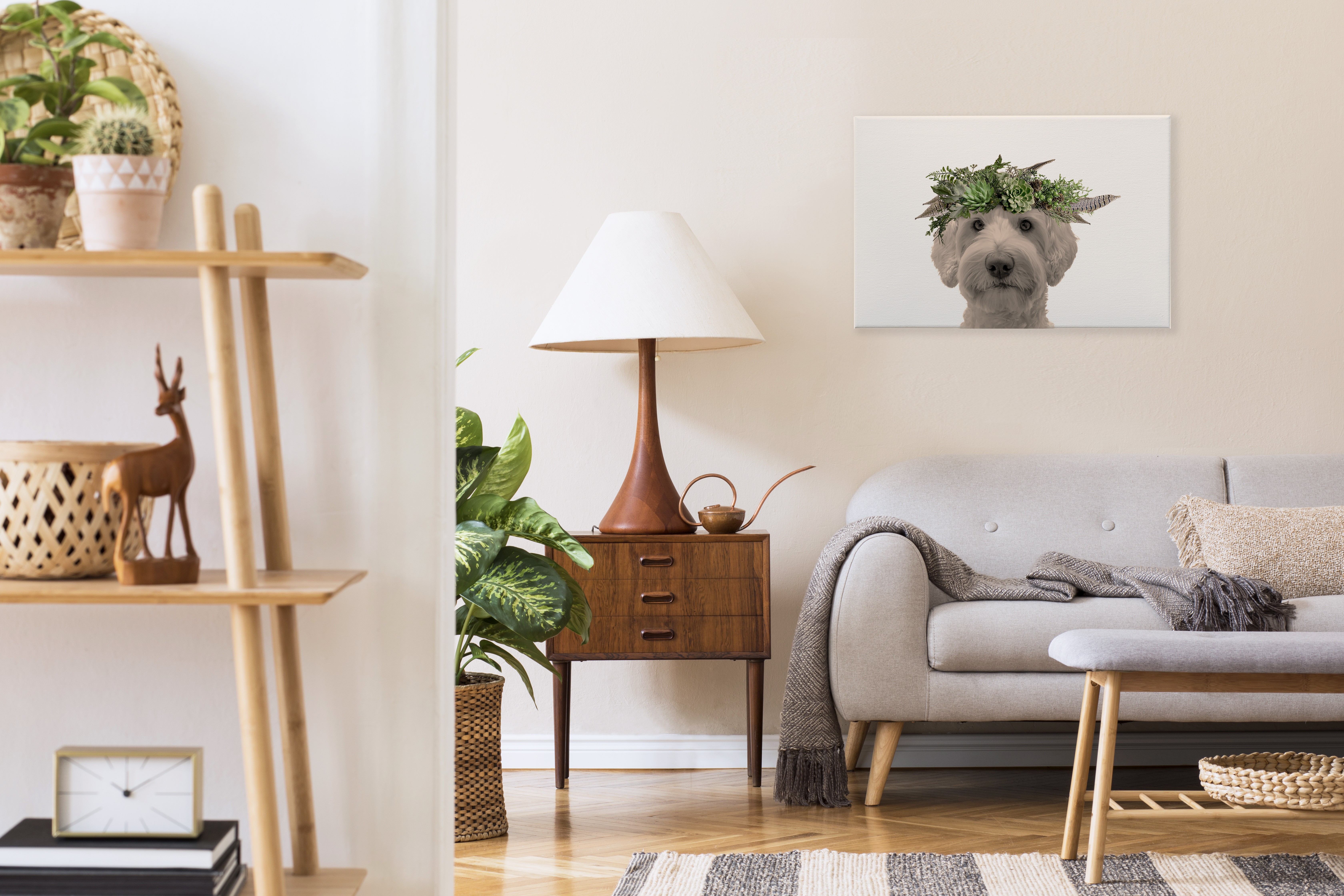
Wooflore custom pet portrait of a dog in a flower crown, hung above a grey sofa in a living room

Wooflore

For Wooflore, a custom pet portrait brand, we developed a cohesive visual identity, created performance-focused advertising creatives and refined the ecommerce website to support conversion and growth.

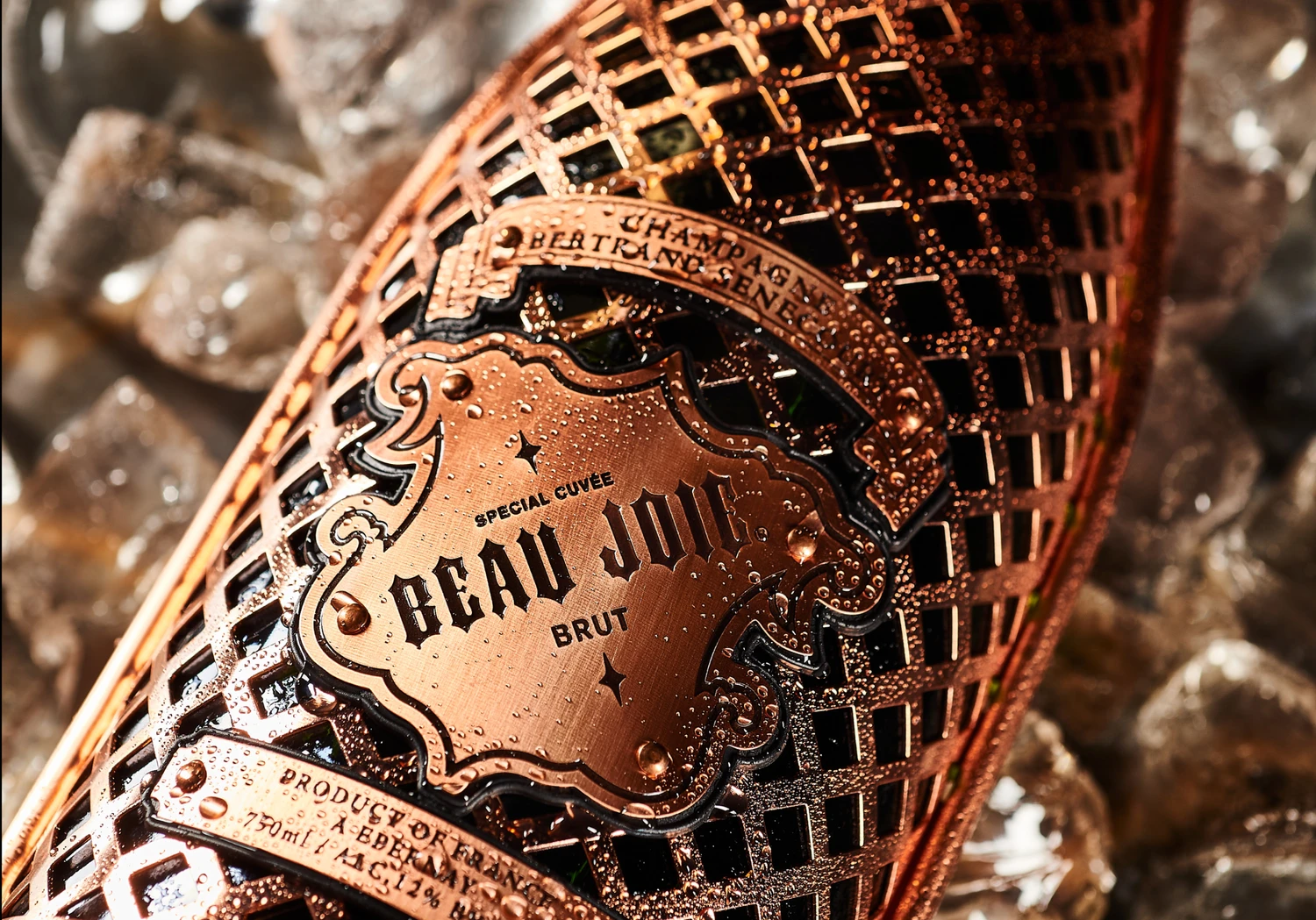
Beau Joie Brut Special Cuvée bottle in its copper lattice sleeve, chilled on ice

Beau Joie Champagne

For Beau Joie Champagne, we managed the UK social presence and developed premium communication materials — supporting the brand’s positioning within global luxury, nightlife and high-profile collaborations.

Backwoods Security Services tri-fold brochures with industrial pipeline and construction-site photography

Backwoods Security

For Backwoods Security, a Canadian provider of industrial security solutions, we developed structured brochures and a clear iconography system to support communication across complex operational environments.

ZEISS logo sign on a glass-clad building against a blue sky

Zeiss

For ZEISS, we developed a comprehensive point-of-sale concept and graphic system, working alongside Ignite Studio to support the interior implementation and ensure a cohesive retail environment.

ZEISS logo sign on a glass-clad building against a blue sky

Zeiss

For ZEISS, we developed a comprehensive point-of-sale concept and graphic system, working alongside Ignite Studio to support the interior implementation and ensure a cohesive retail environment.

FAQ

Get quick answers about working with us and our approach to digital solutions.

What’s included in a monthly retainer?

01

Each retainer includes a set number of design or strategy requests per month, priority turnaround, and a dedicated point of contact. It’s built for teams who want ongoing support without starting from scratch every time.

How many requests can I make per month?

02

We typically handle up to two active requests at a time, with new ones queued as they’re completed. Most deliverables are turned around within 48–72 hours, depending on complexity.

Is a retainer better than a one-off project?

03

If you need ongoing design support, faster turnarounds, or regular iterations, a retainer is often more cost-effective and collaborative than starting fresh each time.

Who will I be working with?

04

You’ll work directly with senior designers and strategists. No middle layers, no fluff—just experienced people doing the work.

Do you work with international clients?

05

Yes. Most of our clients are remote. We’re fully set up to collaborate across time zones with clear communication and shared tools.

Make it happen

Make it happen

Make it happen